The Brief
My Response
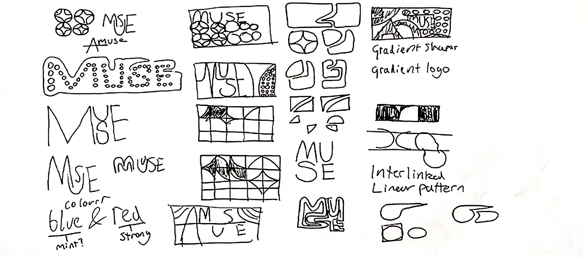
Prototype 1: Muse
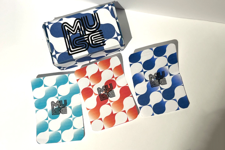
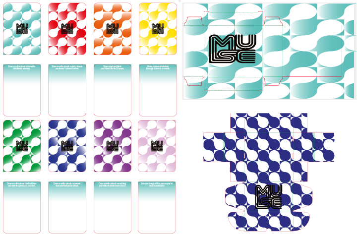
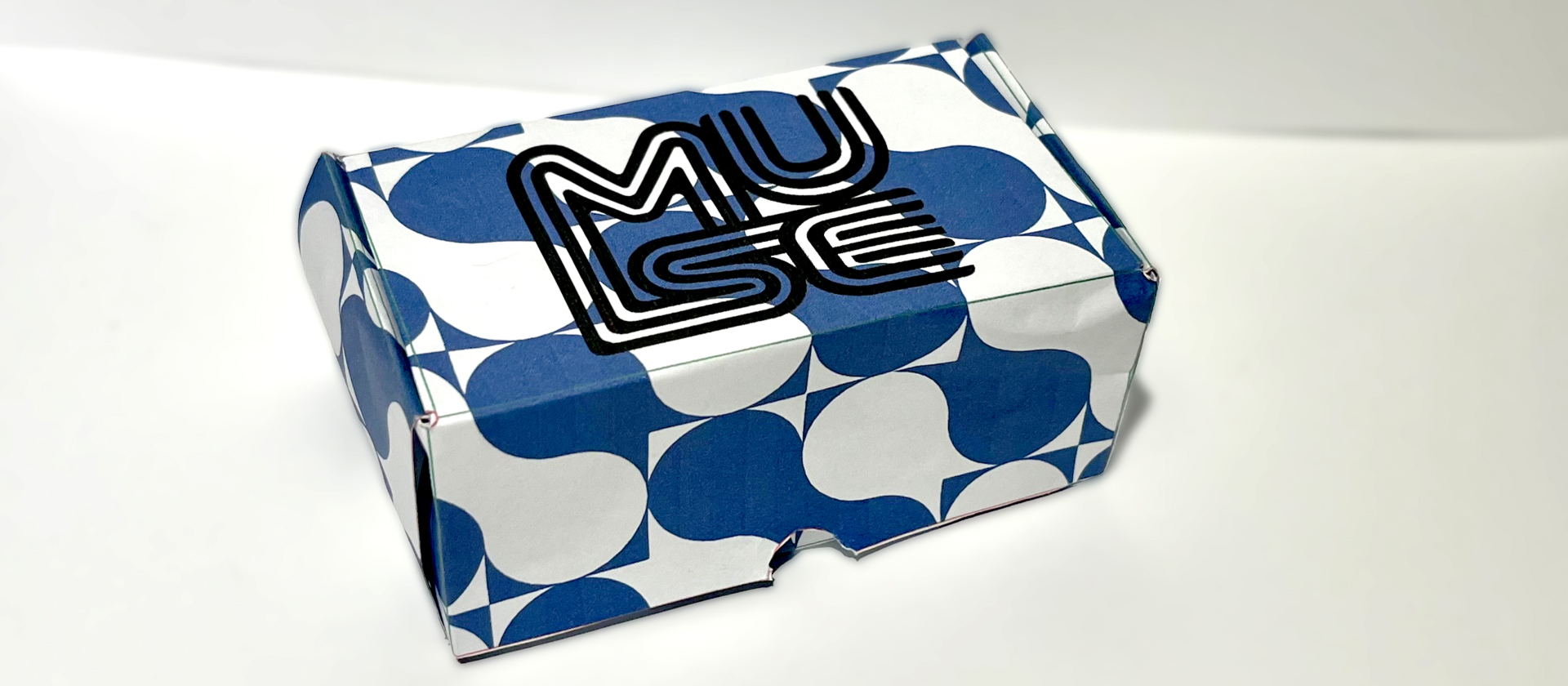
My topic is self-expression, and my research shows that social and self-connection is vital to self-expression, and I think I visualised that with the design choice. The card game explores this further through questions that encourage people to use forms of expression (Writing or Drawing) to answer the prompts. These prompts are subtle introspective questions and help promote reflection which is an especially important part of self-expression.
Prototype 2: Know Your Flow
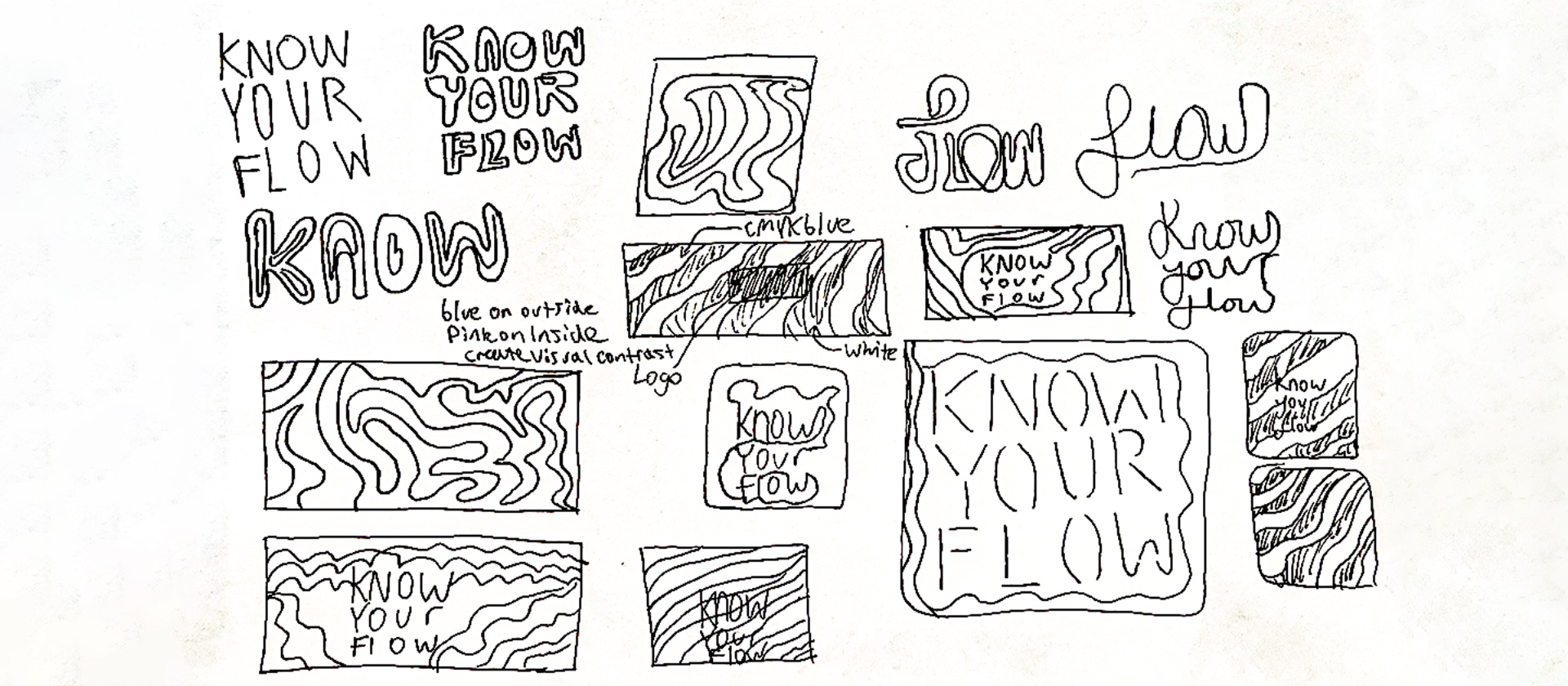
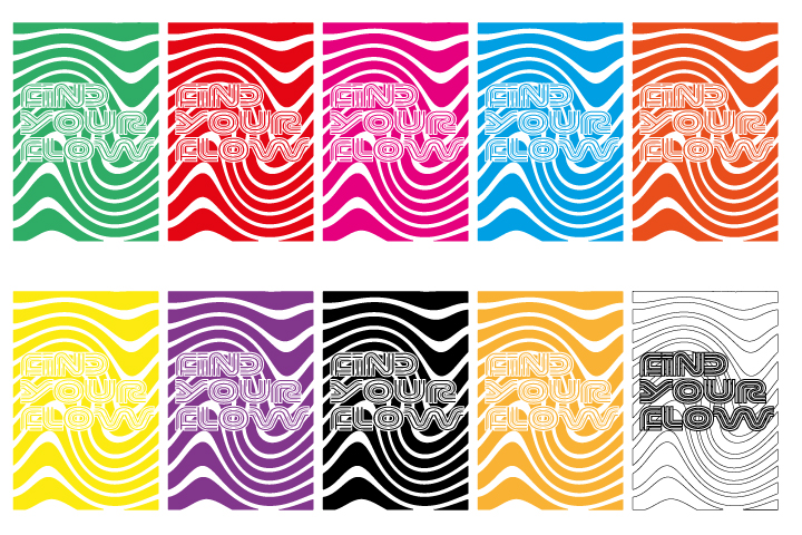
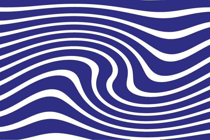
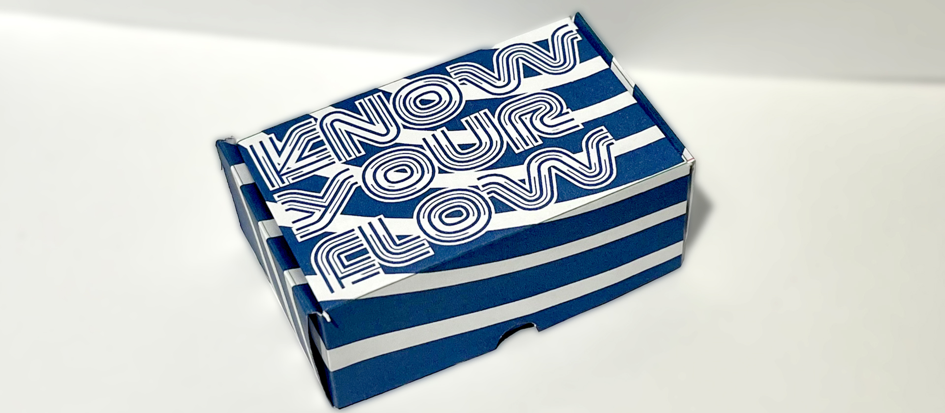
For the cards I experimented with more colours. Overall, I liked aspects of what I created and think it keeps with the theme whilst being influenced by research. However, if I had more time, I would switch the focus to make the font flow better and simplify the graphic style.
Development
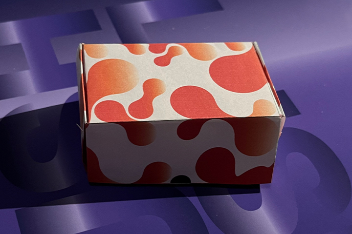
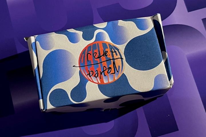
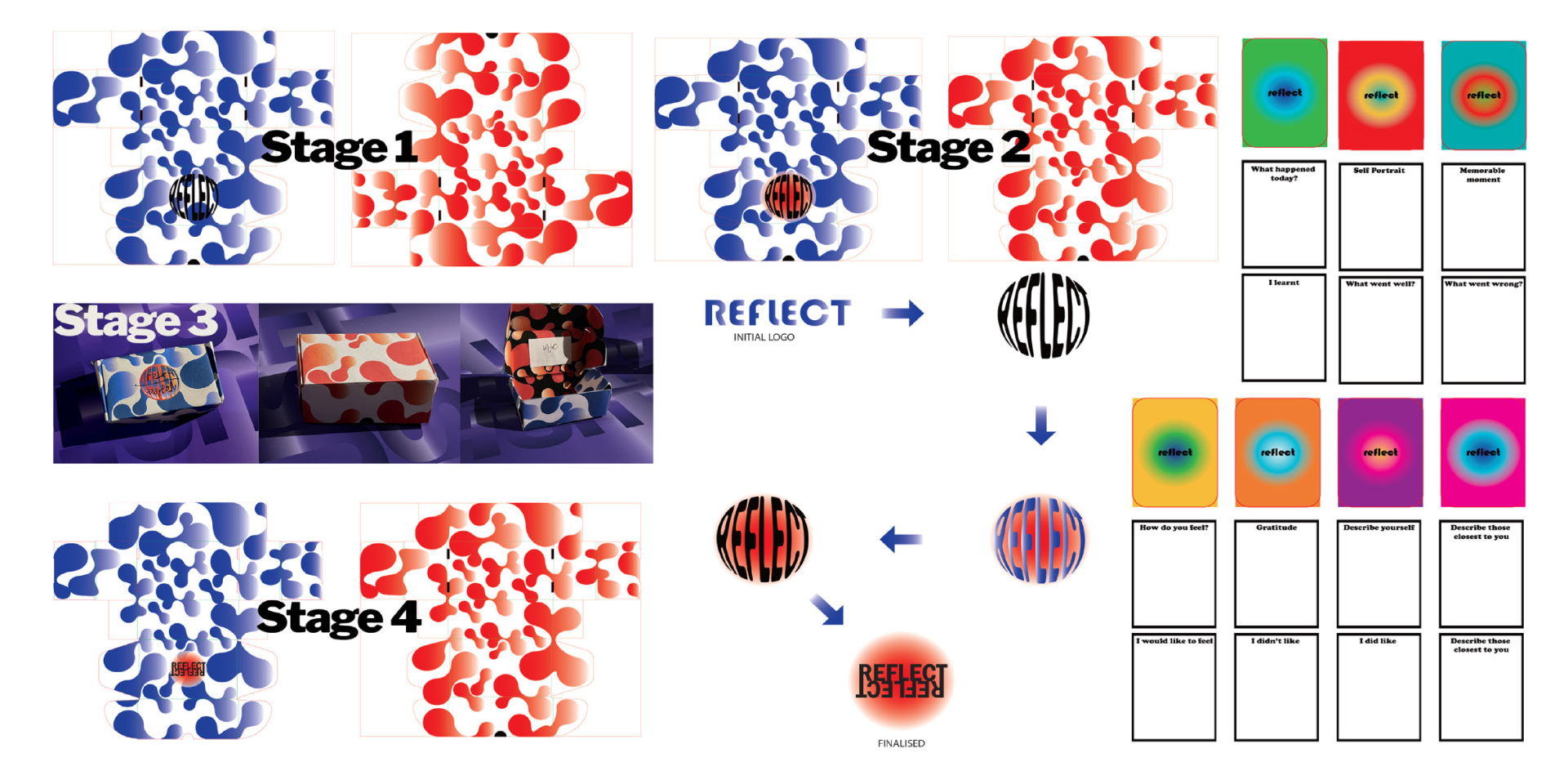
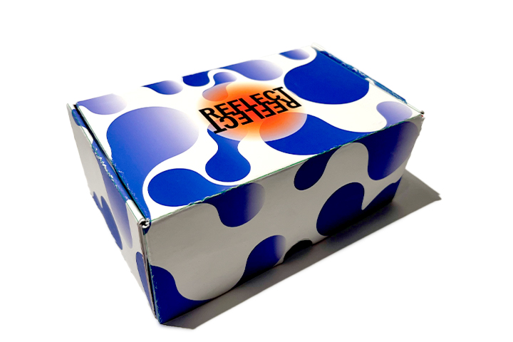
I received praise for the pattern but was told the logo wasn’t readable. Also, when I saw someone open it, I also realised you couldn’t see what the logo said as it was flipped. So, I redesigned the logo and made it readable from all angles, this improved the visibility and brand identity as the Reflect name was reflected in the logo which visualises the name. The cards followed the same gradient style but with assorted colours to represent different emotions.
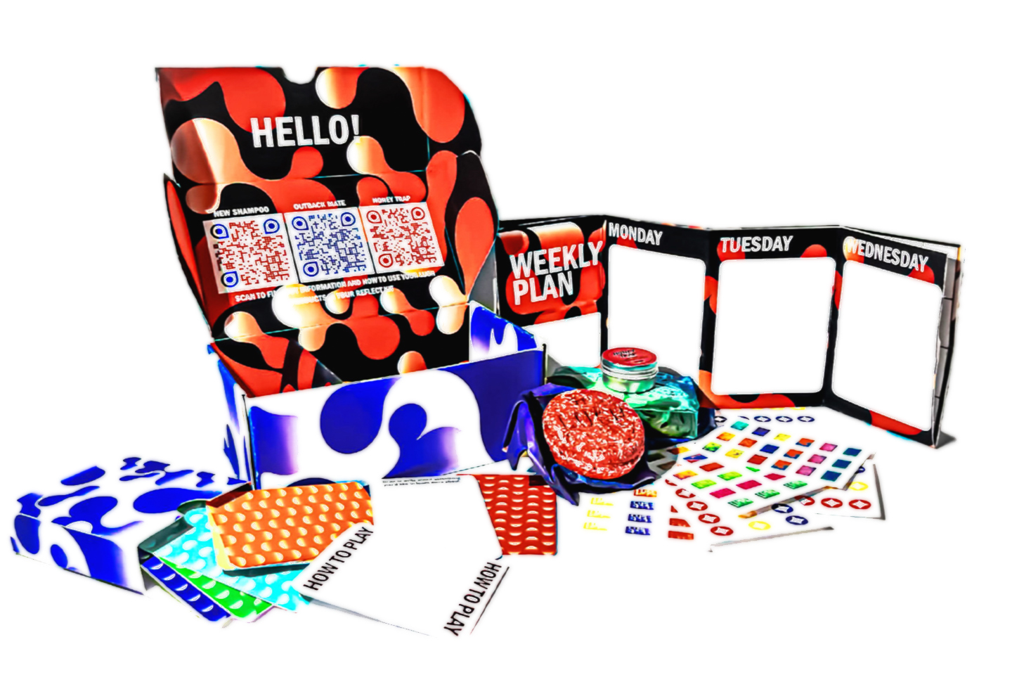
Design Outcomes
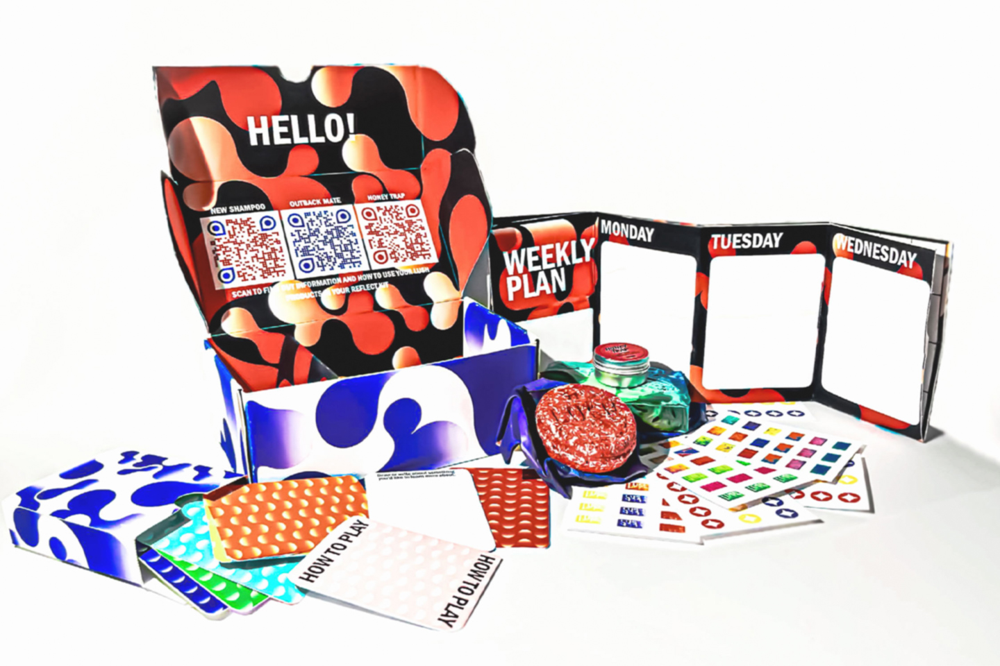
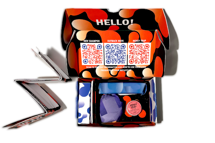
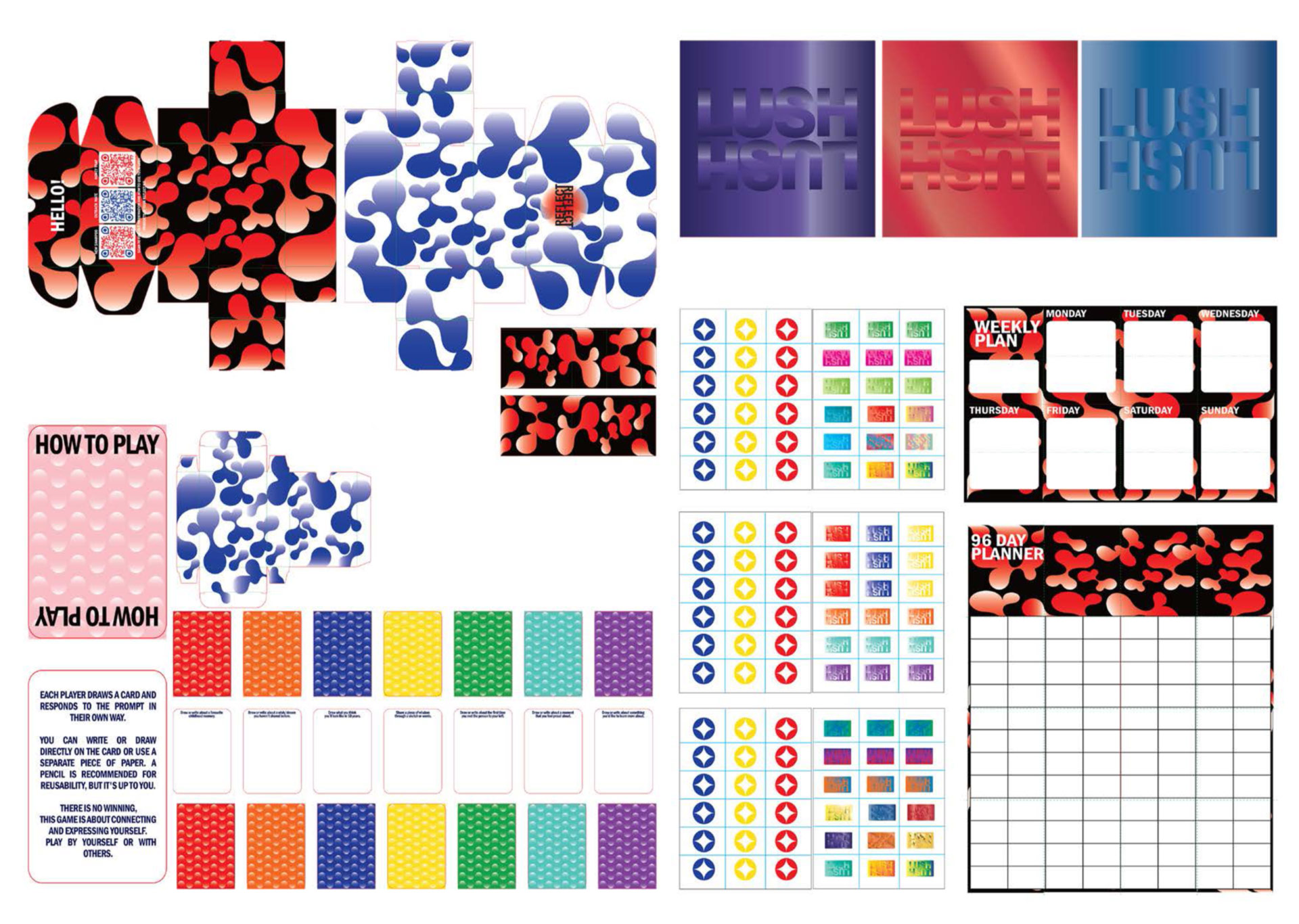
Overall, I strongly believe that this toolkit would help anyone who struggles with self-expression, at a festival or outside one. There is a lot of designed freedom with this kit which is essential for people to express themselves. It is fun to use and look at, informative for self-reflection and has scannable information on the products it carries which follow a similar colour palette to the box’s design.
Research Process Book